UNDP and the World Bank
Created a color-coded map of collaborations between UNDP and the World Bank in 95 countries, using QGIS and drawing on data from the two organizations.
UNDP’s Administrator used this map in his presentation at the World Bank Town Hall.
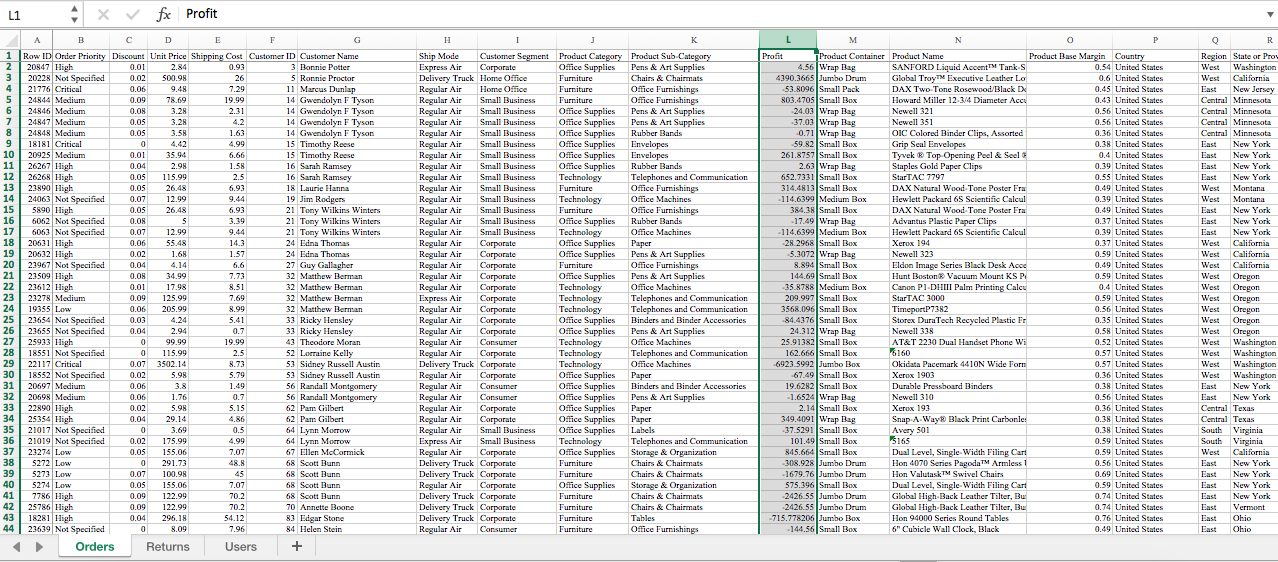
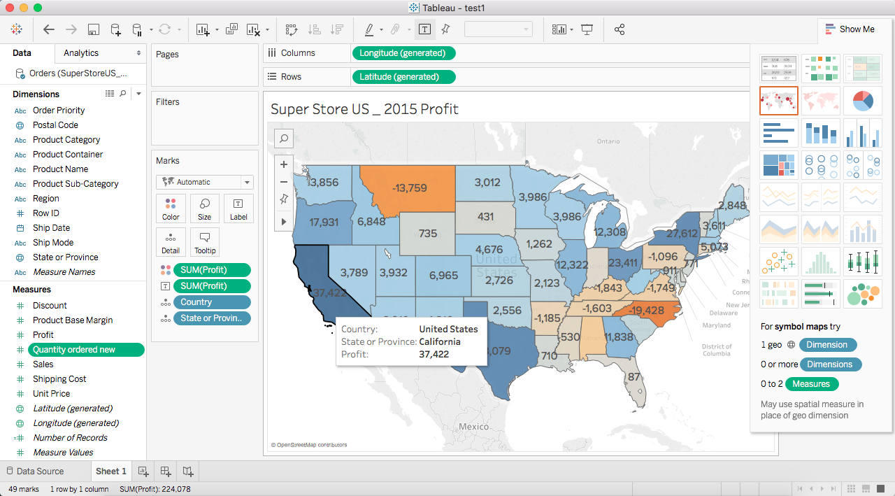
Map of the sum of profit (made on Tableau)
From the map it is clearly showing that the most profitable state is California, which could lead to further marketing decisions.
UNDP Partnerships Brochures (UNDP partnership with countries, International Financial Institutions, and Private Sectors & Foundations)
Worked with diverse departments throughout the organization, helped them clarify their communication needs, and designed the infographics for donor brochures. These brochures were used to build partnerships with donor countries, international financial institutions, and major corporations and foundations.


